beimu莞城旗旗舰店的委托方希望通过空间设计策略进一步完善其品牌范式。
设计师的创作逻辑由三部分构成:大时代背景下商业模式的变迁与消费者心理的拿捏;全球化语境中文化审美的独特性与不取悦性;始于概念完于形式的渐进式设计细化技术.
设计师主张弱化产品,强调空间,以空间自身的魅力留住访客,并实现更强的商业交互。互联网发展使得空间,变身为现实与虚拟双重世界的新空间。因此,现代商业空间的设计不止靠单纯的审美判断,还得承担起品牌认同媒介的责任。
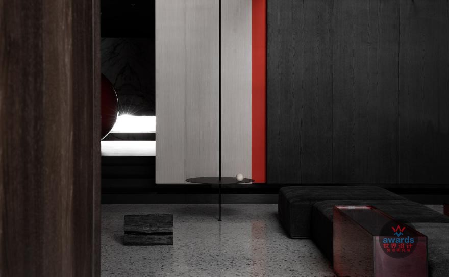
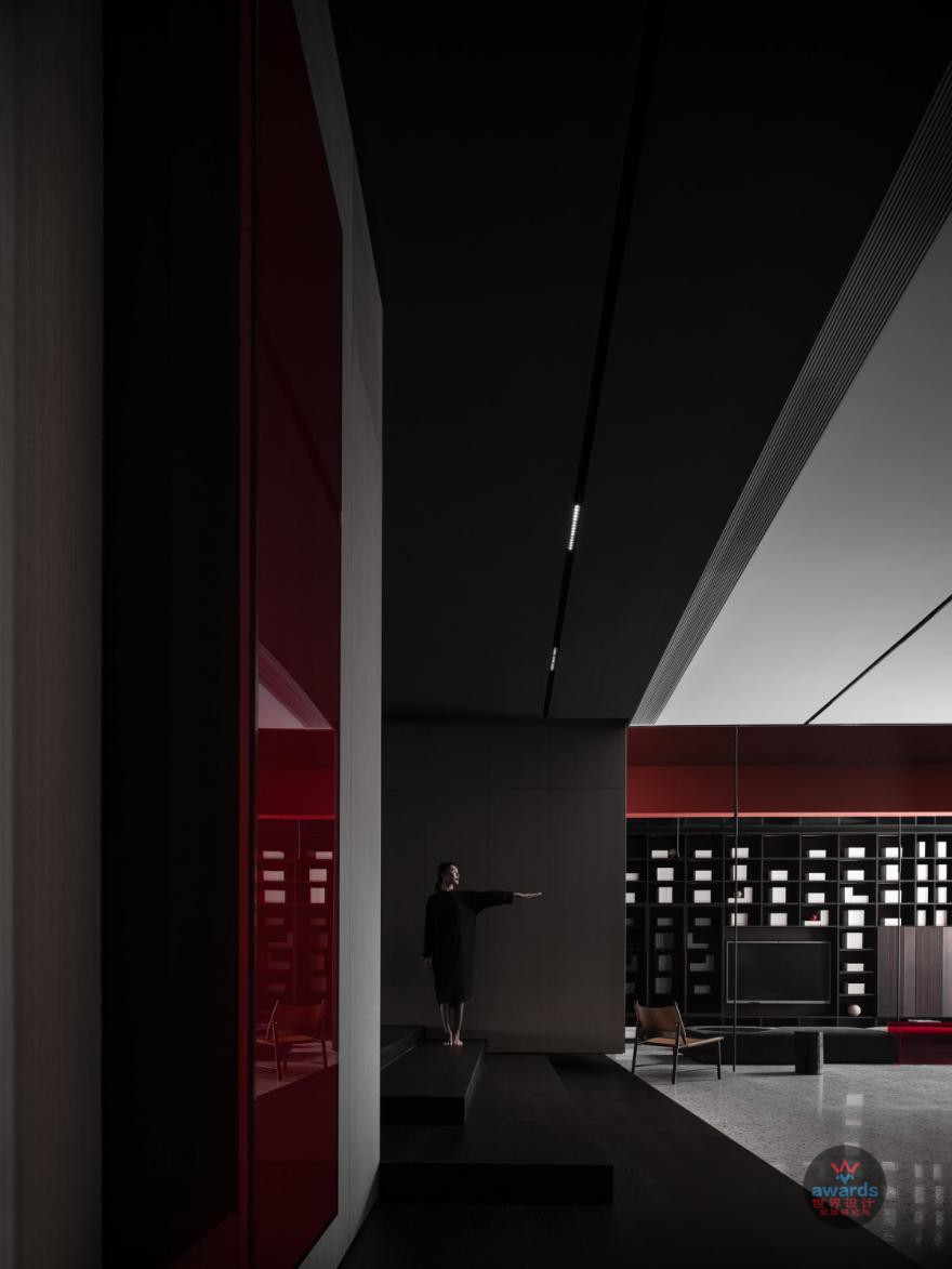
同时,设计师着力打造品牌的象征与精神传达。通过建筑立面以简约的线条切割出黑白色块,被凸显的品牌标识一旁,仅开一个三米三见方的橱窗形成里外的互窥关系。规避传统商业空间一目了然的刻板做法,橱窗扮演着“灵魂和眼睛”的角色,向路人发出心动信号.红与黑建构出一个时间停滞的迷宫,引导访客观察关注疏离化之后的陌生感。被刻意拉长的通道一方面是作为情绪的调整过渡,另一面是进一步加强初访者的好奇心.镜像、楼梯,及对光的巧妙运用,无不连接着人与空间的感情。
如何缓和买卖双方的对立关系是设计师思考的重点。
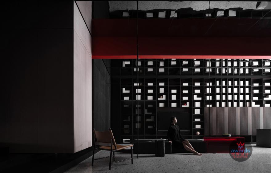
提供多元的洽谈场景供访客选择,设计师的目的指向弱化空间的商业特性。不同尺度与款式的桌椅组合,昭示着该空间不只是商业洽谈的场所,也可以成为老朋友聚会的会所,更是适合周边居民的休闲歇息的地方。(549字)
beimu client of Guancheng flag flagship store hopes to further improve its brand paradigm through space design strategy.
The creative logic of designers consists of three parts: the change of business model and the pinch of consumer psychology under the background of the great times, the uniqueness and unpleasure of cultural aesthetics in the context of globalization, and the gradual design refinement technology which begins with the concept of form.
Designers advocate weakening products, emphasizing space, retaining visitors with the charm of space itself, and achieving stronger business interaction. The development of the Internet makes space become a new space of reality and virtual world.Therefore, the design of modern commercial space depends not only on simple aesthetic judgment, but also on the responsibility of brand identity media.
At the same time, designers strive to create brand symbols and spiritual communication. Through the building facade with simple lines to cut black and white blocks, highlighted by the brand logo side, only open a three-meter window to form a peeping relationship inside and outside. Avoid the traditional business space at a glance stereotype, window plays the role of "soul and eyes ", to passers-by send a heartbeat. Red and black construct a maze of time stagnation, leading visitors to observe the strangeness after alienation. The deliberately elongated channel, on the one hand, is a transition to emotional adjustment, and on the other hand, it further strengthens the curiosity of the initial visitor. Mirror image, stairs, and the clever use of light, all connect the feelings of man and space.
How to ease the antagonistic relationship between buyers and sellers is the focus of designers' thinking.
Provide multiple negotiation scenarios for visitors to choose from, the designer's purpose is to weaken the commercial characteristics of space. The combination of tables and chairs with different scales and styles shows that the space is not only a place for commercial negotiation, but also a clubhouse for old friends gathering, but also a place for leisure and rest for the surrounding residents.
上一页
1
2
3
45
6
7
8
下一页
共有 8 页 24条记录


